Purpose:
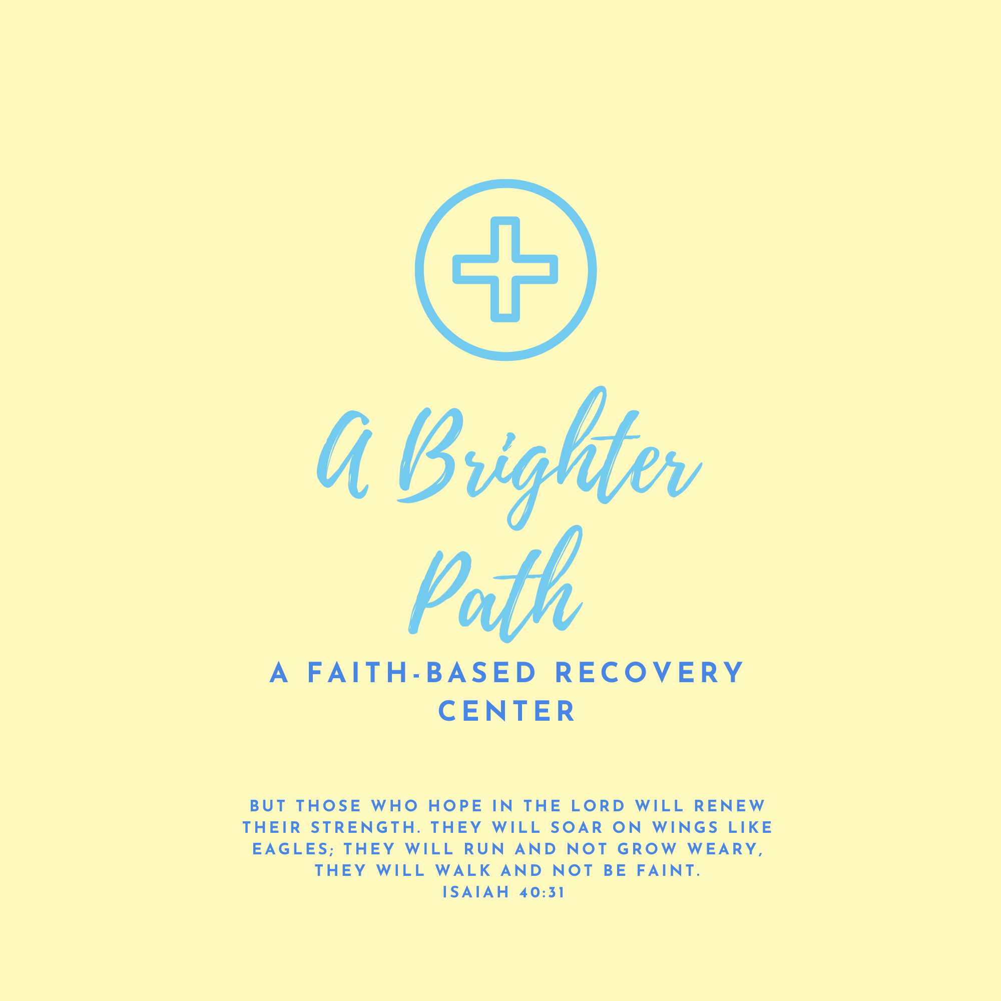
The purpose of this logo was to represent A Brighter Path as a faith-based rehab center focused on hope, healing, and growth. I wanted the design to show the idea of moving forward and finding a better path in a way that feels welcoming and encouraging.
Audience:
The audience includes people looking for support in recovery, their families, and anyone interested in a faith-based program. The logo is meant to connect with people who value faith, support, and positive change.
My Role:
I designed the logo on my own, from the initial idea to the final version. This included developing concepts, choosing colors, and selecting fonts that fit the brand's message.
Outcome:
The final logo gives A Brighter Path a clear and consistent look. It helps communicate the center's mission and can be used across various materials to build recognition and trust.